Schoolifi
2026
Building a 1000+ Variant Design System Using Atomic Design Methodology
A scalable, accessible design system built on atomic design principles — 40+ components, 1000+ variants, and full light/dark theming, engineered for cross-platform product consistency.
Overview
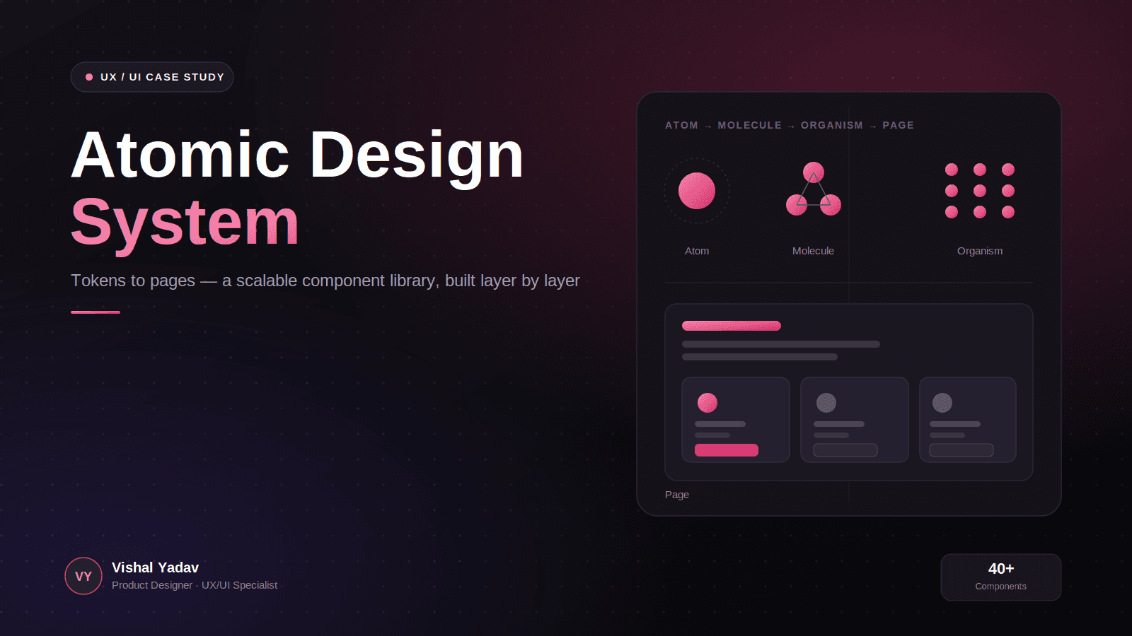
Atomic Design System — A Scalable UI Component Library
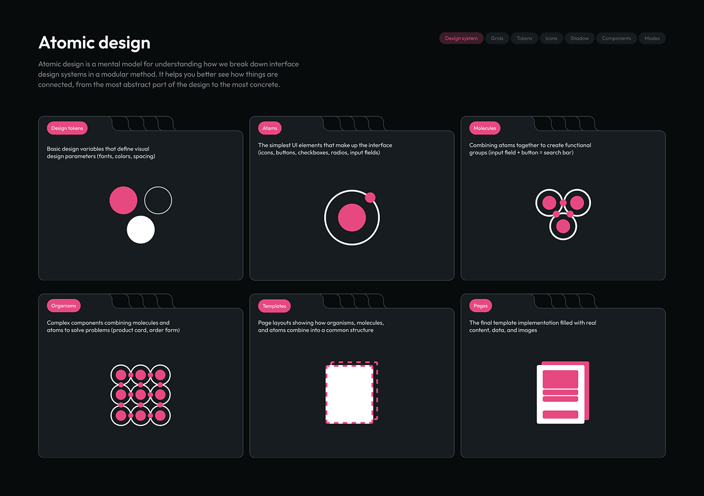
As a Product Designer and UX/UI Specialist, I led the end-to-end design and architecture of a comprehensive design system using atomic design methodology — breaking interface design down into Design Tokens, Atoms, Molecules, Organisms, Templates, and Pages. This system was built to solve real product-consistency problems: fragmented UI patterns, redundant component builds, and slow design-to-development handoff.
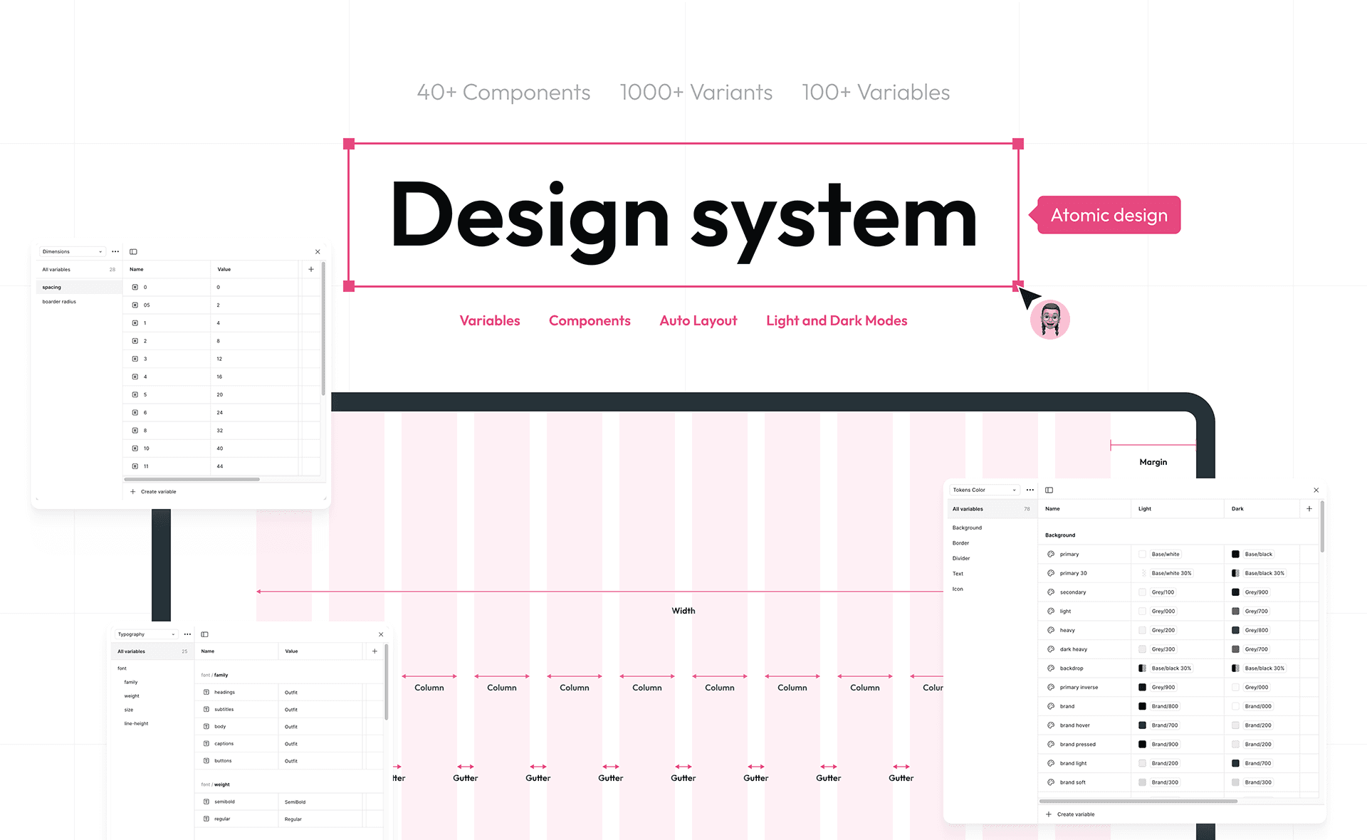
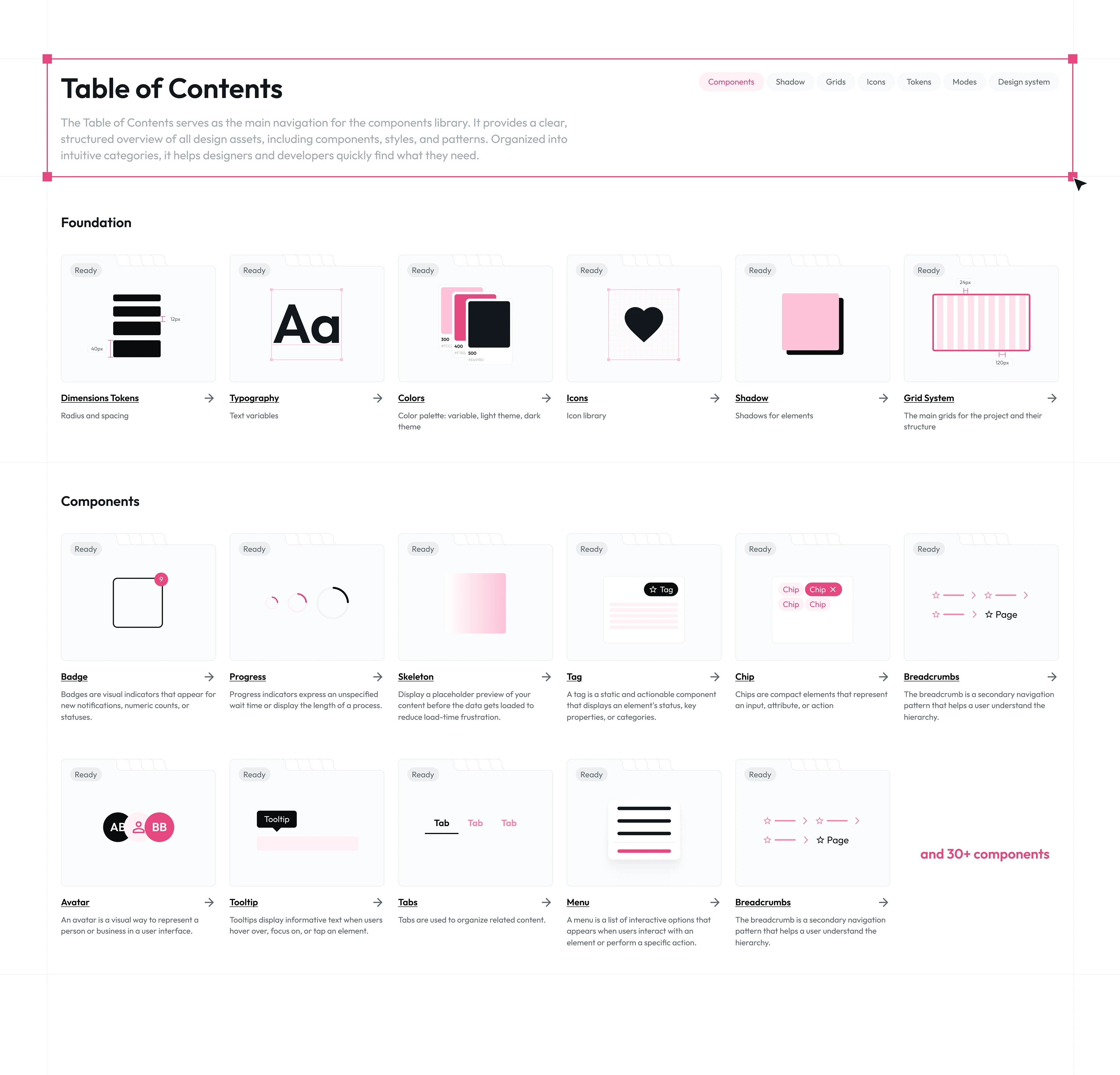
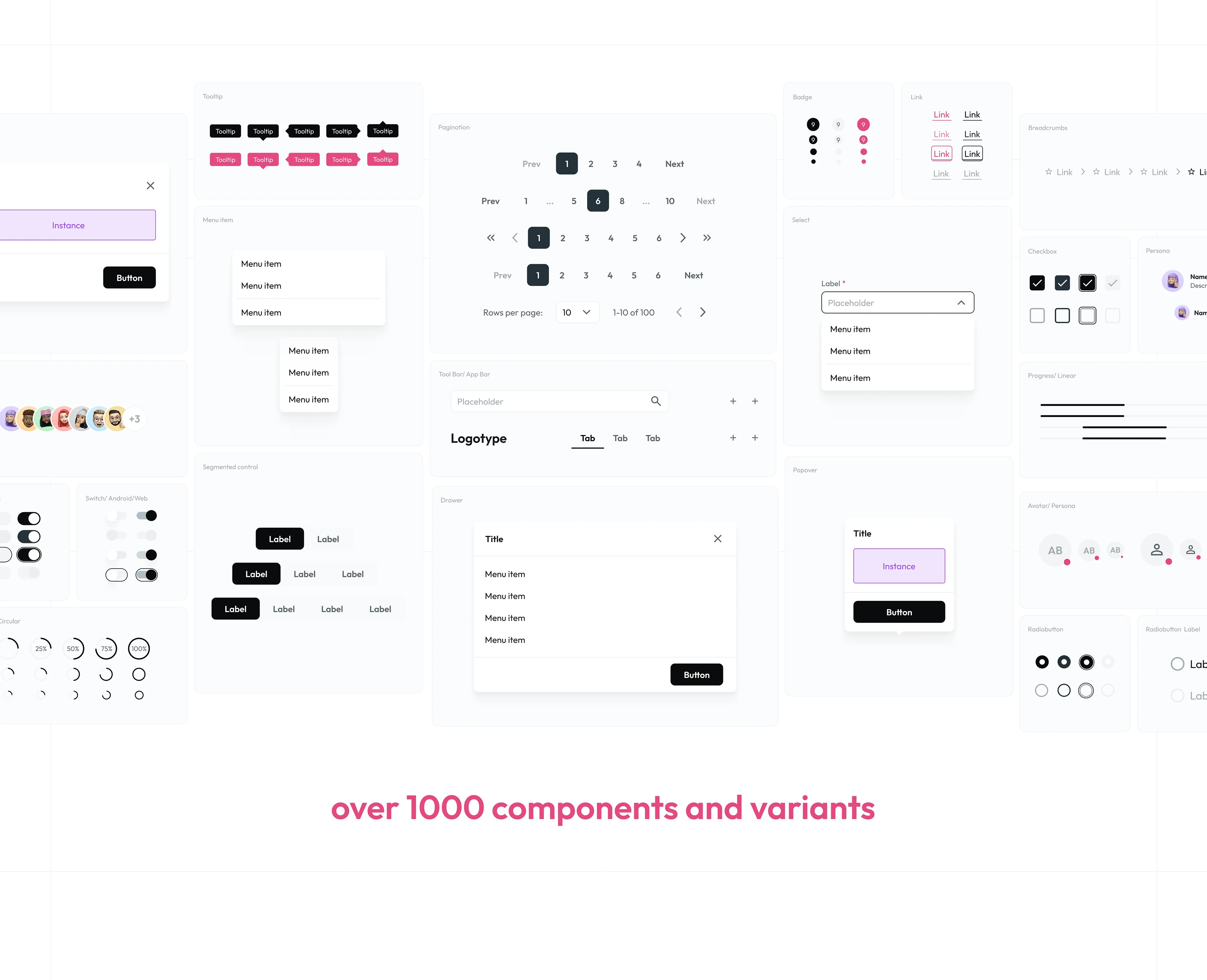
The result is a Figma-native component library with over 40 components, 1000+ variants, and 100+ design variables, covering everything from foundational color tokens and typography scales to complex UI patterns like data tables, date pickers, and multi-state form components. The system supports full light and dark mode theming, meets WCAG accessibility contrast standards, and is structured for scalability across web and mobile products.
This project reflects core UX design, interaction design, visual design, and design systems architecture skills — with a strong focus on component-driven design, design tokens, accessibility, and developer handoff.
Problem
Growing product teams often ship UI inconsistently — every screen rebuilds buttons, forms, and cards from scratch, with no shared source of truth. This leads to visual drift, slower handoff, and duplicated design/dev effort.
When every screen speaks a different language
Growth exposes the cracks in unsystemized design. What starts as a handful of screens quietly becomes dozens — each one built in isolation, each one just slightly different from the last. A button here, a slightly darker shade of the same "primary" color there. Nobody decided this should happen. It just did.
That's the real cost of designing without a system: not one big failure, but a thousand small inconsistencies that quietly erode trust, velocity, and craft.
Where it was breaking down:
Consistency was accidental, not designed. The same component existed in five variations across the product — not because anyone chose that, but because nothing stopped it.
The source of truth didn't exist. Colors and type were hardcoded, screen by screen. A one-line brand update meant hunting through dozens of files, hoping nothing got missed.
Handoff ran on guesswork. Developers were reverse-engineering spacing and states from static mockups — translating intent into code, one assumption at a time.
Accessibility was left to chance. No systematic contrast checks, no defined focus states — compliance was a lottery, not a guarantee.
Every feature paid the same tax. Teams kept rebuilding the same forms, tables, and modals from zero — solving problems that had already been solved, over and over.
The real cost
This isn't just a design problem — it's a velocity problem. Every inconsistency is a decision someone has to make twice. Every hardcoded value is a future bug. Left unsolved, this doesn't stay flat — it compounds, quietly, with every new screen shipped.
The mandate
Build a system that makes the right choice the easy choice — a token-driven, atomic design system that turns consistency into a default, not a discipline. One source of truth, from the smallest variable to the most complex page, documented well enough that design and engineering stop negotiating and start shipping.
Skills
Design Systems | Atomic Design | UI/UX Design | Figma | Design Tokens | Component Library | Interaction Design | Visual Design | Accessibility (WCAG) | Responsive Design | Design-to-Dev Handoff | Dark Mode Design | Variant Management | Design Ops | UI Documentation | Cross-Platform Design | Product Design
Research
Foundation First: Building the Design Token Architecture
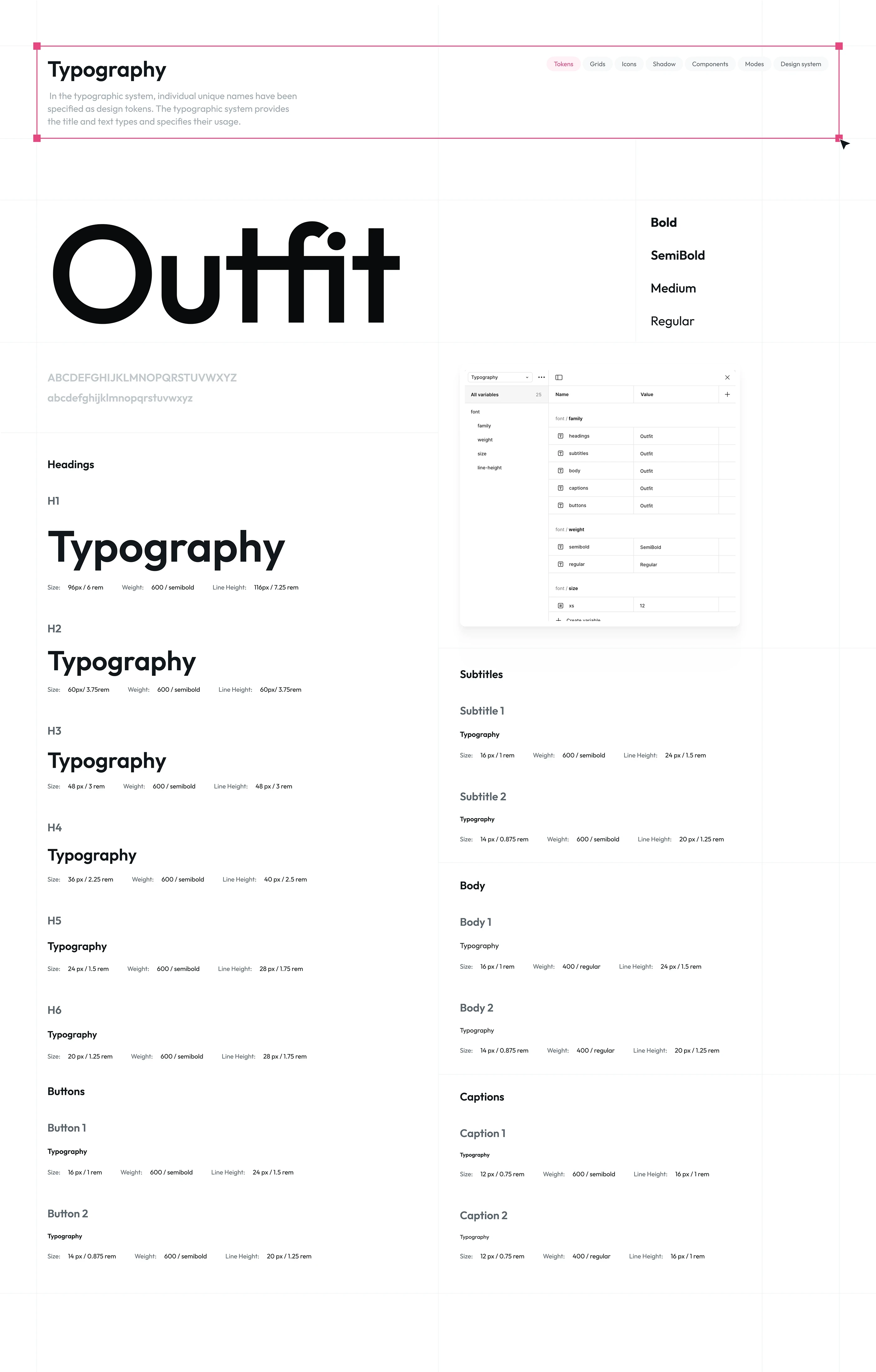
Every scalable design system starts with structure, not screens. I began by auditing existing UI inconsistencies and defining a three-tier token architecture — Primitive, Semantic, and Component-level tokens — covering color, typography, spacing, radius, and elevation. This foundation ensures the entire system remains themeable, accessible, and future-proof, supporting both light and dark modes from a single source of truth.
Design token architecture, UI audit, scalable design system, accessible, themeable
Foundation
Smallest Reusable UI Building Blocks
Atoms
Atoms: The Smallest Reusable UI Building Blocks
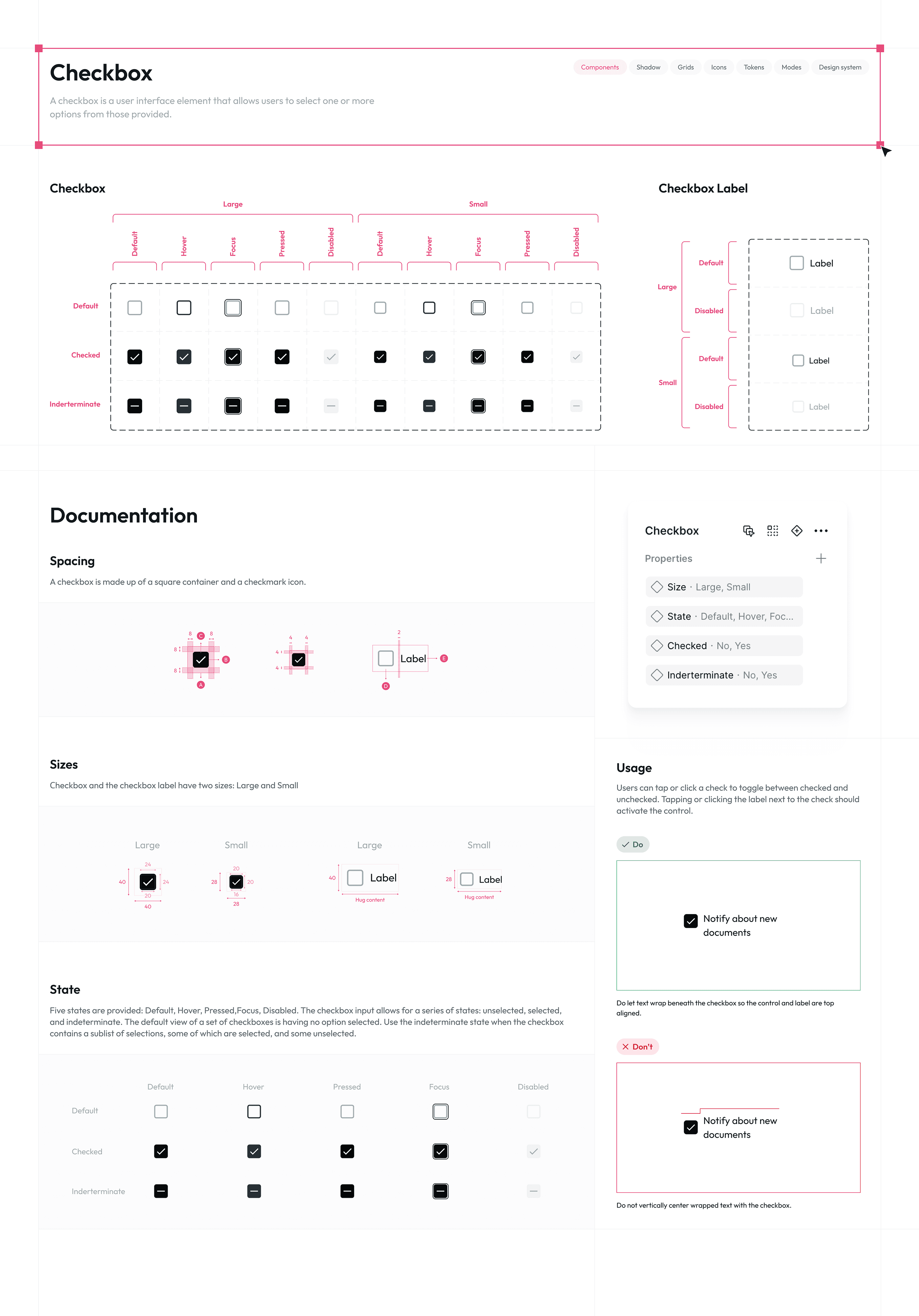
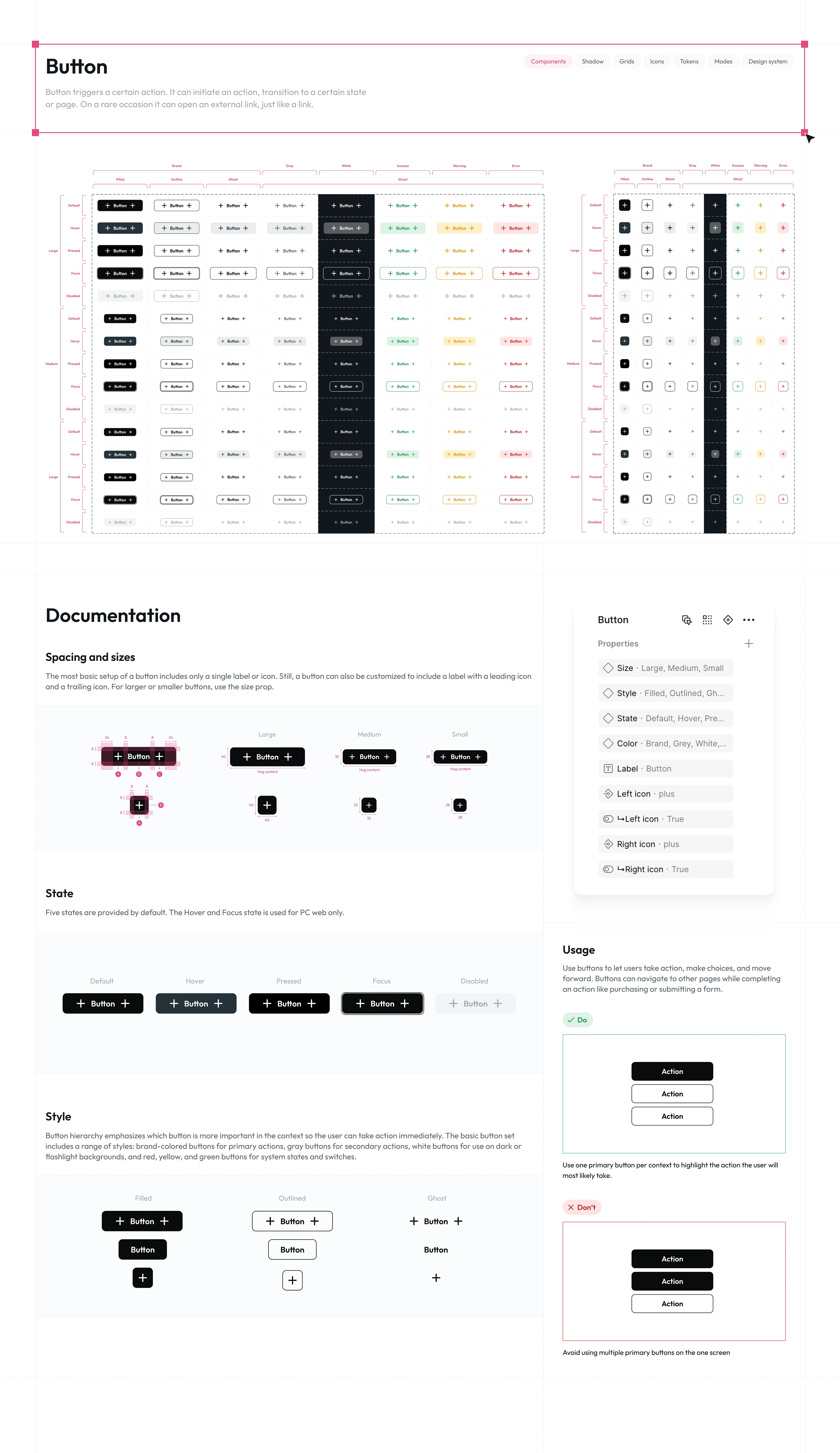
I defined the system's foundational atoms — buttons, inputs, icons, checkboxes, and typography styles — each built as reusable Figma components with documented states, variants, and accessibility contrast ratios (WCAG AA/AAA). This atomic layer ensures visual and functional consistency across every higher-level component in the library.
Molecules
Combining Atoms into Functional UI Patterns
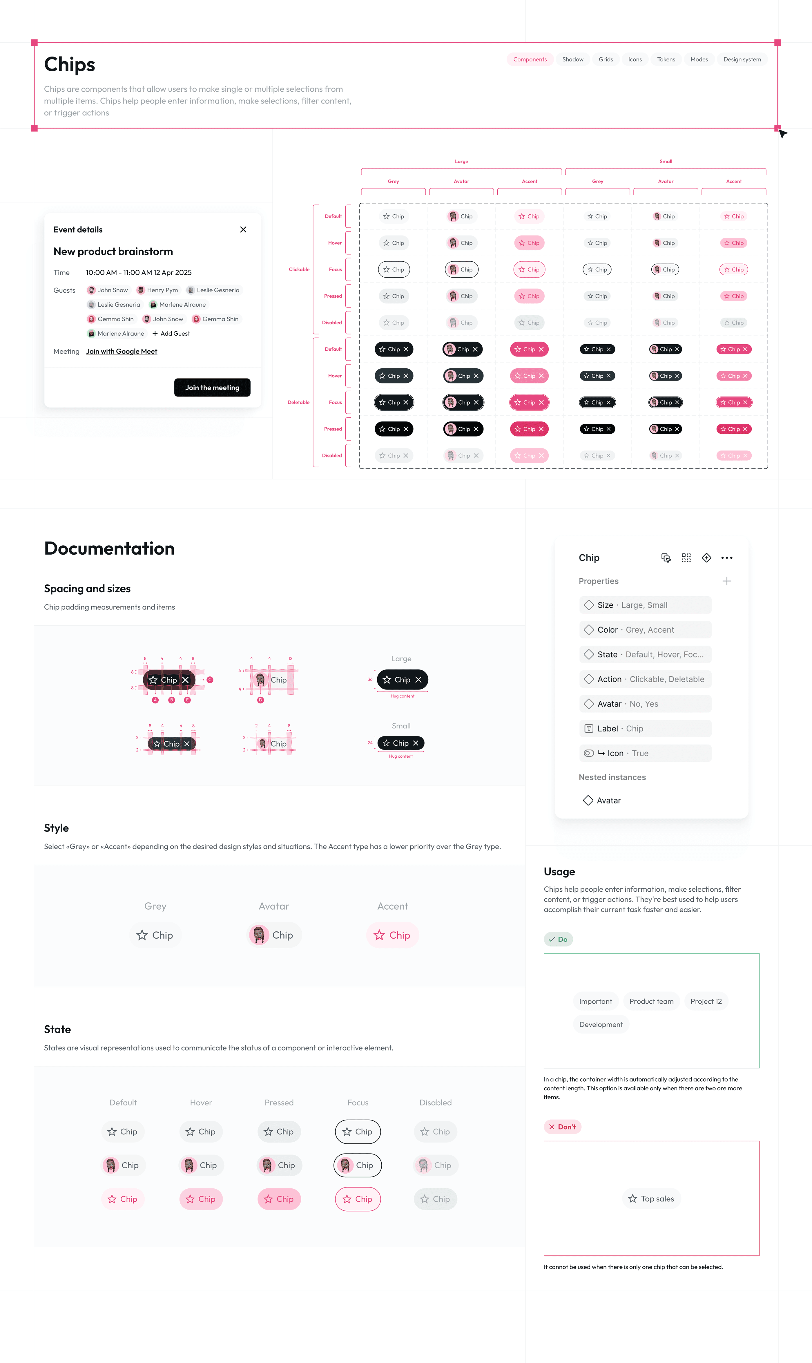
Atoms were combined into functional molecules — form fields, search bars, chips, and navigation items — each designed with complete state management (default, hover, focus, error, disabled) and documented usage guidelines. The Button component alone supports 7 color variants, 3 styles, 3 sizes, and 5 interaction states, totaling hundreds of production-ready combinations.
Organisms & Templates
Organisms & Templates: Complex, Real-World UI Patterns
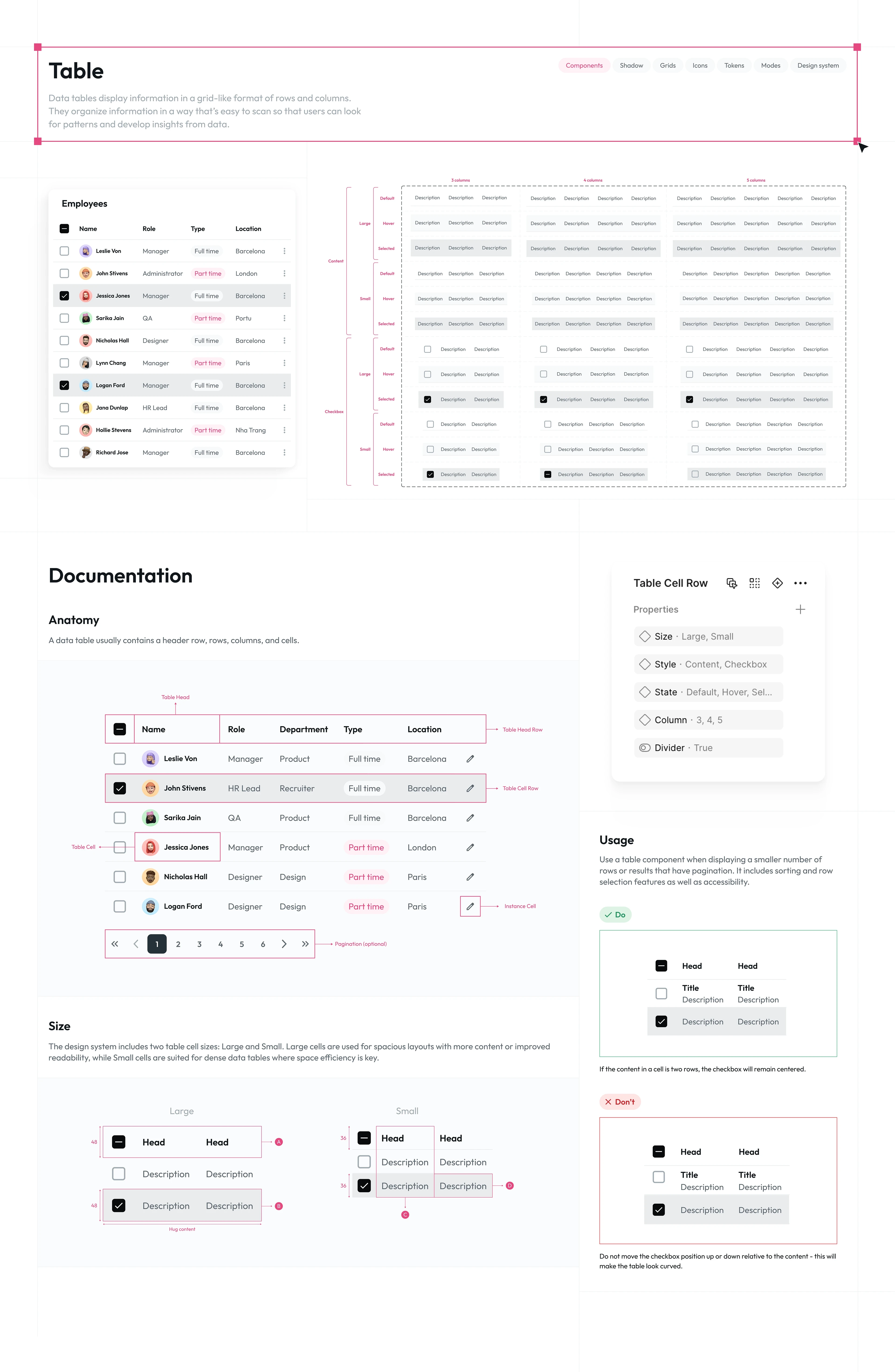
At the organism level, I designed complex, reusable UI patterns — data tables, date pickers, drawers, popovers, and pagination — tested against real content scenarios rather than placeholder text. These organisms were then assembled into page templates, proving the system holds up across realistic, content-heavy product screens.
Documentation & Governance
Documentation, Dark Mode & Design System Governance
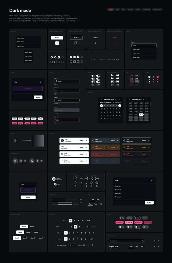
The final phase focused on scalability and adoption: full dark mode support across all 40+ components, a searchable component library in Figma's Assets panel, and clear Do/Don't usage documentation for every pattern. This governance layer ensures the system remains consistent and easy to adopt as the product team scales.
Impact
From inconsistent UI to a single source of truth
Reduced UI inconsistency across product screens, cut design-to-development handoff time, and established a single source of truth for designers and developers — enabling faster feature shipping without sacrificing visual or accessibility standards.