UX Case Study
2023
Designing a Patient Management App for Independent Healthcare Professionals

Overview
Industry : Healthcare • HealthTech • Patient Management • Mobile App Design
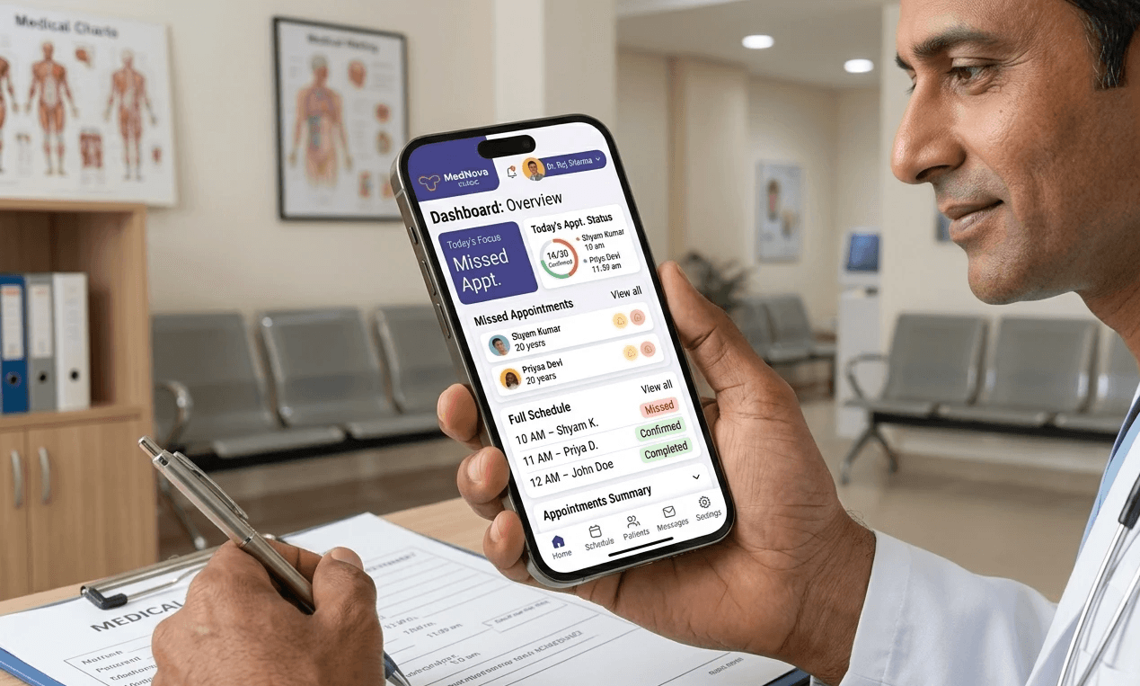
MedNova Clinic is a mobile-first patient management application designed for independent doctors and small healthcare practices. The app simplifies appointment scheduling, patient records, prescriptions, and daily clinic operations through an intuitive mobile experience, helping healthcare professionals reduce administrative work and focus more on patient care.
Industry : Healthcare • HealthTech • Patient Management • Mobile App Design
Problem
Managing Patient Care Felt Unnecessarily Complicated
Independent healthcare professionals often rely on multiple tools to manage appointments, patient records, prescriptions, and follow-ups. This fragmented workflow increases administrative effort, makes patient information difficult to access, and reduces the time available for delivering quality care.
The challenge was to design a mobile experience that simplified these everyday tasks while fitting naturally into the fast-paced environment of small healthcare practices.
Research
Understanding Everyday Clinical Workflows
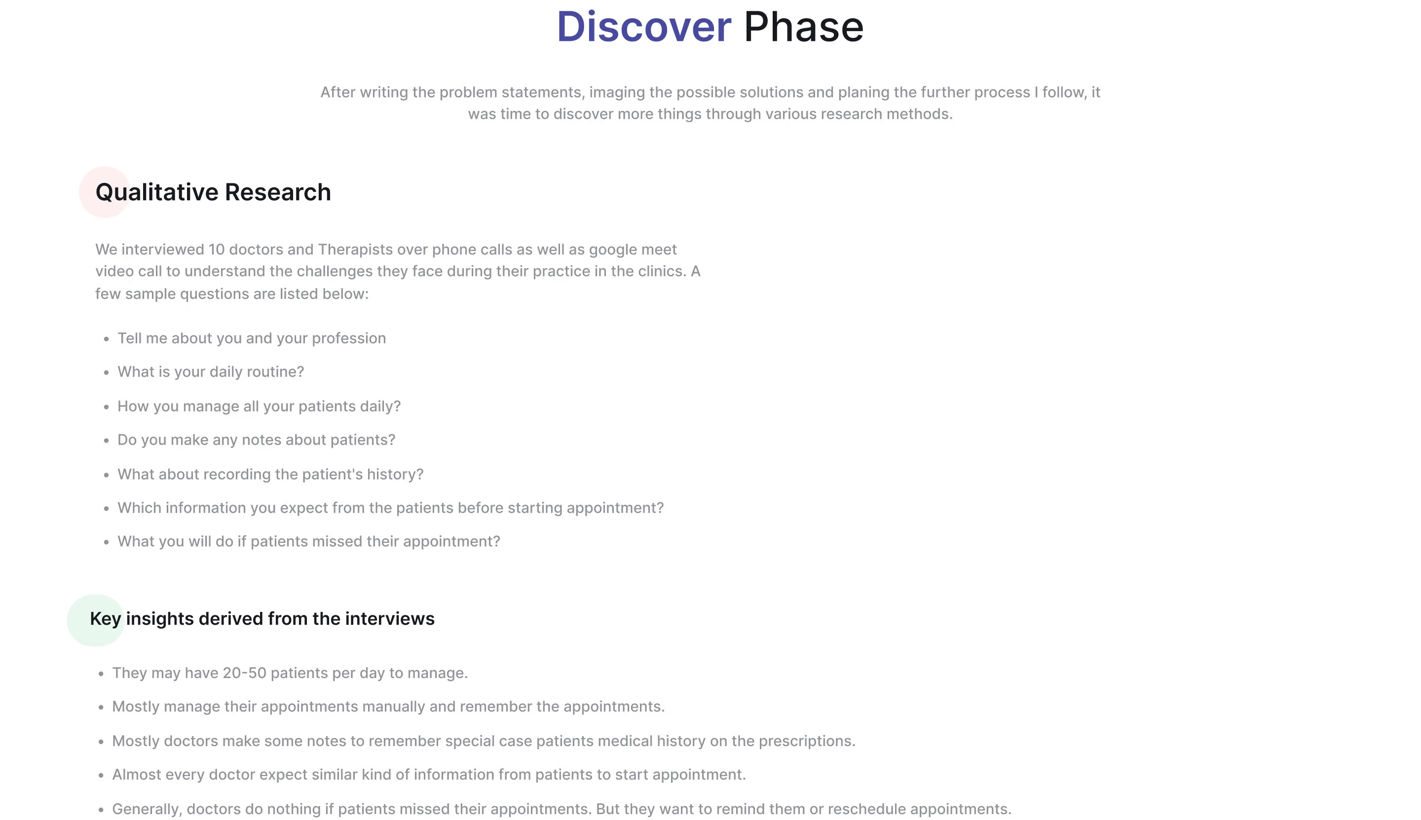
Before exploring solutions, I wanted to understand how doctors and healthcare professionals managed their day-to-day responsibilities.
I conducted user interviews, analyzed existing workflows, and reviewed competing healthcare applications to identify where friction occurred throughout the patient journey. Rather than focusing only on individual features, I explored how appointments, consultations, prescriptions, and patient records connected across a typical working day.
Research Methods
User Interviews
Workflow Analysis
Competitive Analysis
User Journey Mapping
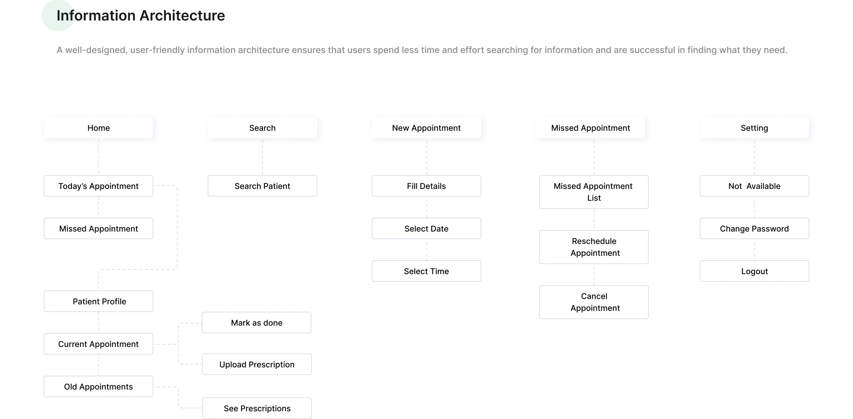
Information Architecture
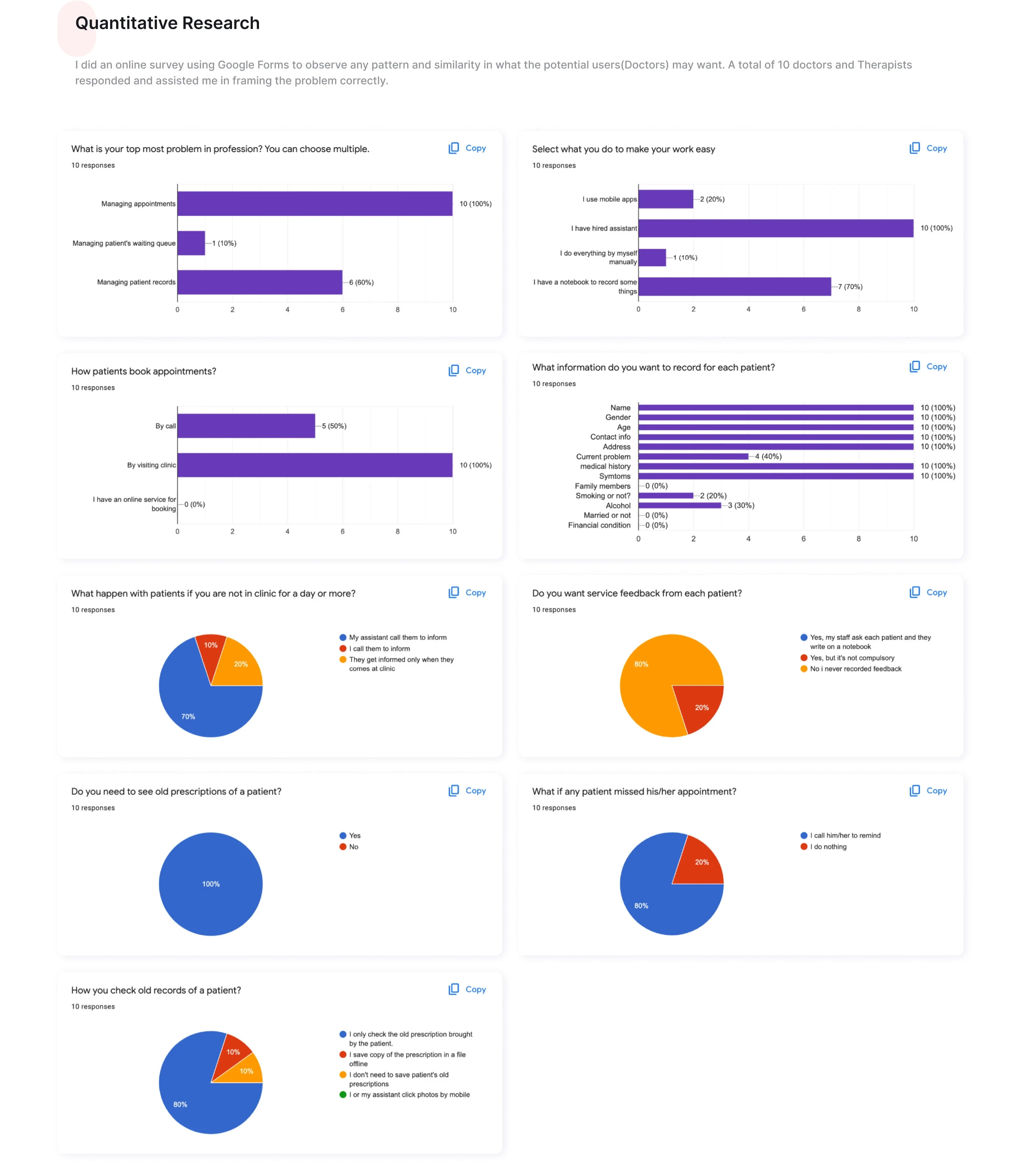
How Do You Currently Manage Your Work?
Current Method | Responses |
|---|---|
Assistant | 100% |
Notebook | 70% |
Mobile Apps | 20% |
Manual Only | 10% |
Survey Summary
Finding | Result |
|---|---|
Doctors struggling with appointment management | 100% |
Doctors using notebooks | 70% |
Doctors requiring previous prescriptions | 100% |
Doctors manually reminding patients | 80% |
Doctors finding patient record management difficult | 60% |
Clinics offering online booking | 0% |
Doctors collecting patient feedback | 20% |
Research Insights
Key Findings from User Research
Fragmented Workflows
Most healthcare professionals switched between notebooks, messaging apps, calendars, and spreadsheets to manage appointments and patient information.
Administrative Tasks Consumed Valuable Time
Routine activities like scheduling appointments, updating patient records, and writing prescriptions reduced the time available for consultations.
Patient Information Was Difficult to Access
Finding previous prescriptions, medical history, and consultation notes often interrupted patient interactions.
Existing Healthcare Software Felt Overwhelming
Many clinic management platforms offered extensive functionality but lacked simplicity, making them difficult to adopt for smaller practices.
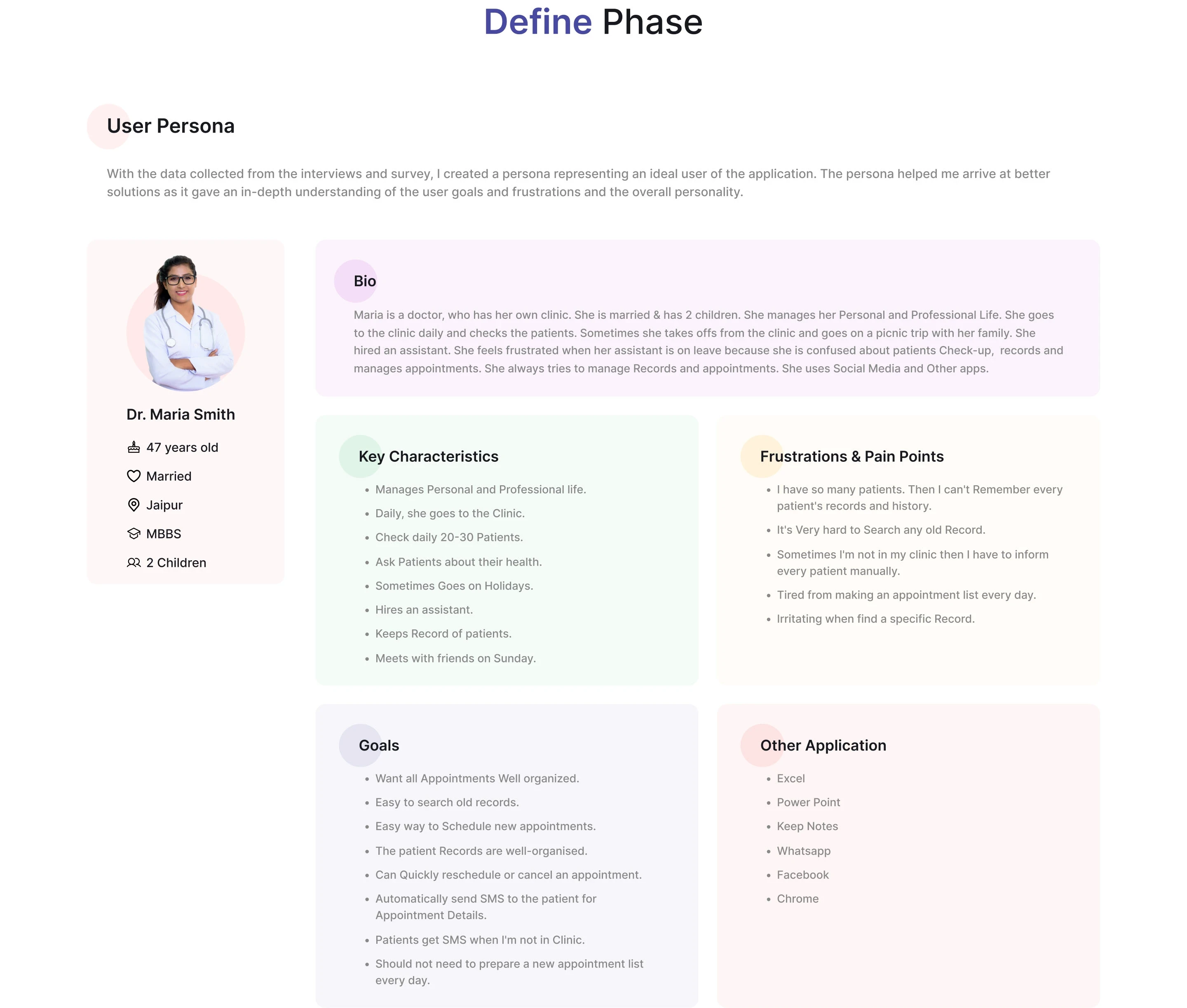
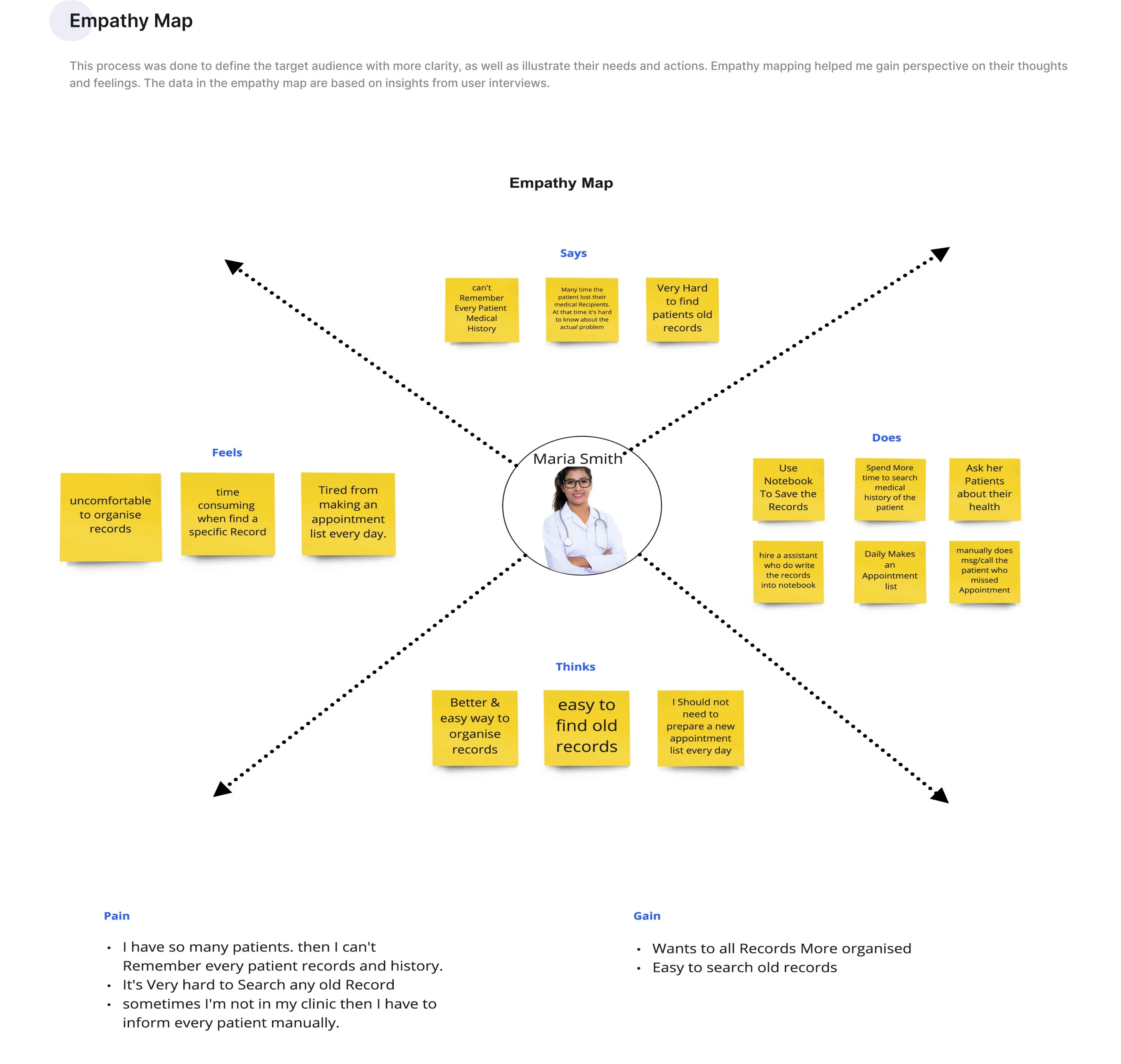
Define Phase:
Ideation
Exploring Simpler Clinical Workflows
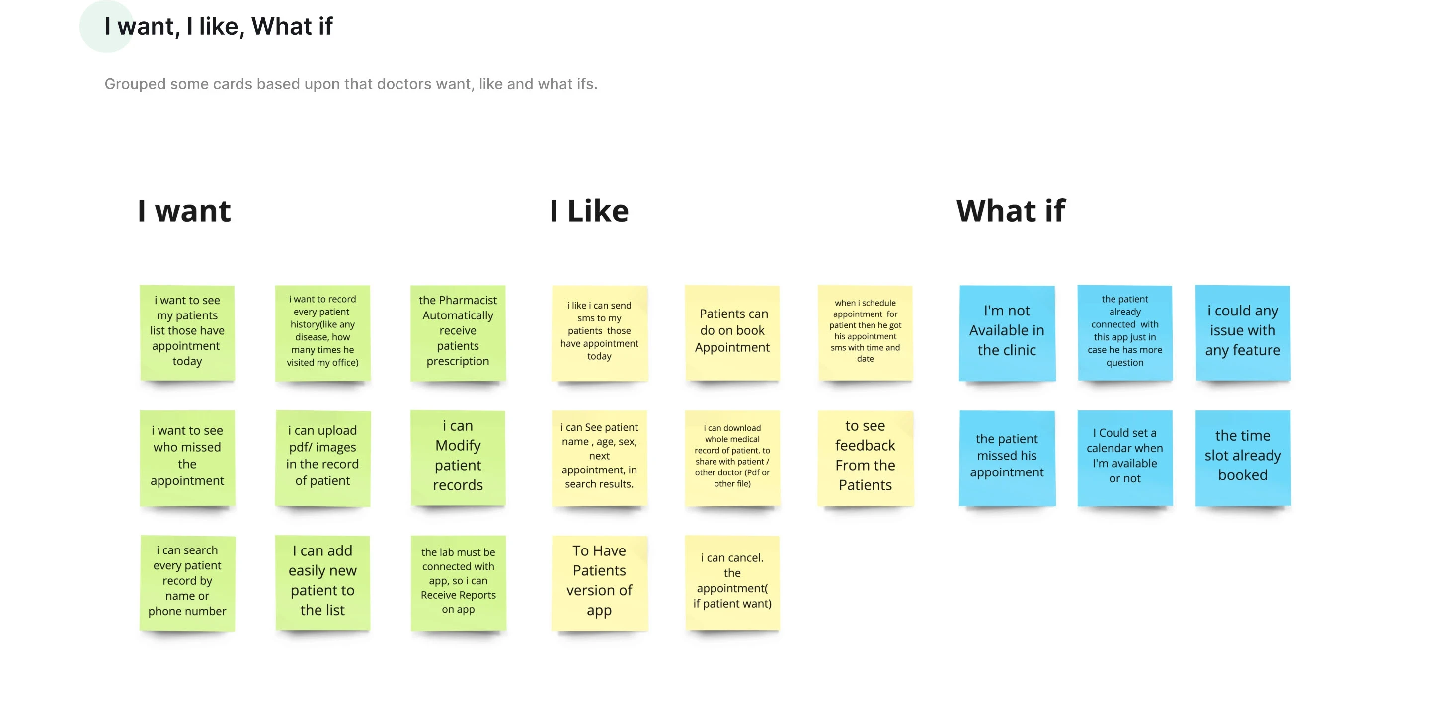
How Might We
Turning Research into Design Opportunities
Based on the research findings, I reframed key user pain points into "How Might We" questions to explore solution-focused ideas. This helped shift the process from identifying problems to defining meaningful opportunities for the product.
Outcome
The HMW exercise guided the design direction by focusing on opportunities to simplify appointment management, streamline patient records, improve information accessibility, and reduce the administrative workload for healthcare professionals.
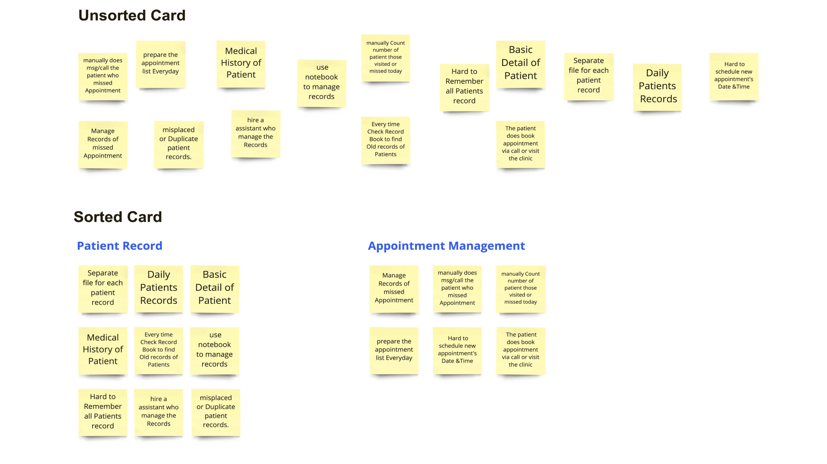
Organizing Information Intuitively
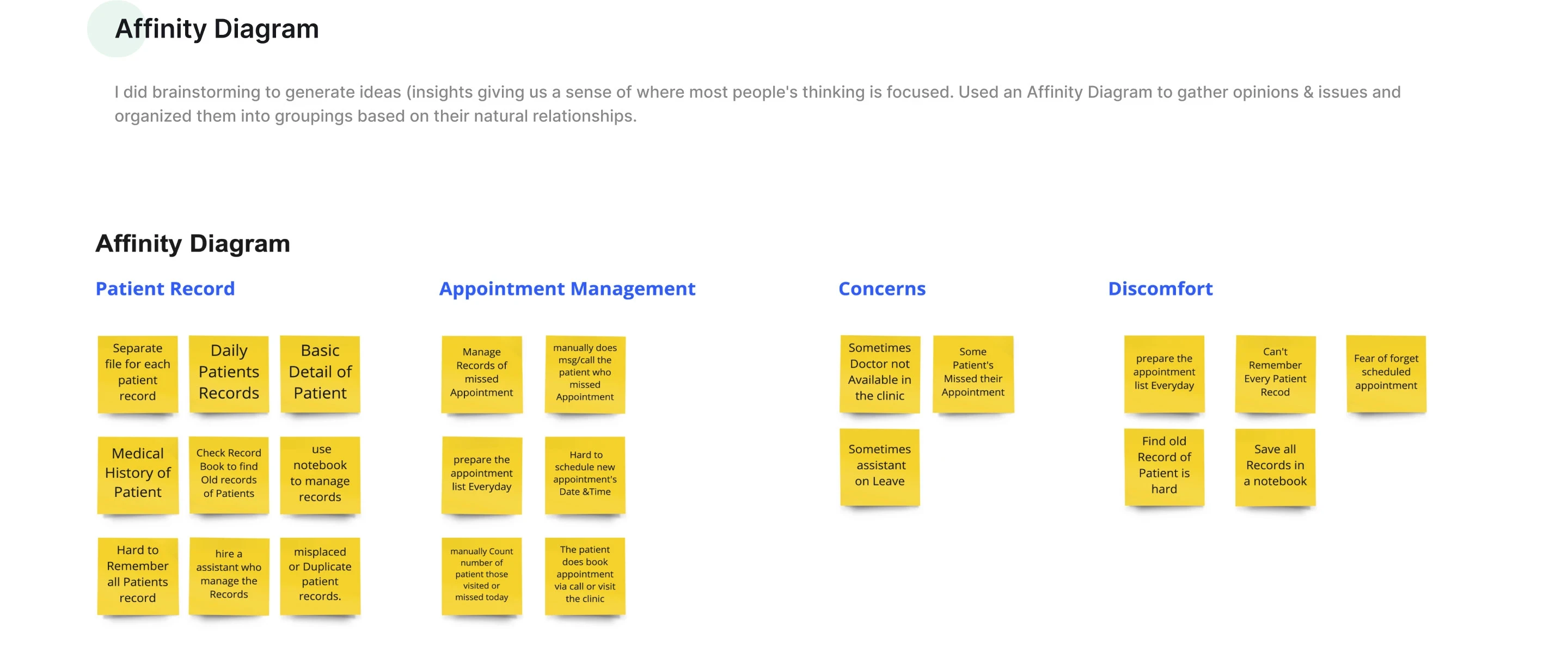
To validate the information architecture, I conducted a card sorting exercise to understand how doctors naturally grouped clinic-related tasks and patient information.
Key Insights
Doctors grouped information into two clear categories: Patient Records and Appointment Management.
Patient history and prescriptions needed to be easily accessible.
Scheduling, reminders, and missed appointments formed a separate workflow.
Outcome
The findings helped shape a simple, intuitive navigation structure that aligned with doctors' mental models and everyday clinical workflows.
User Journey
Mapping the Patient Management Experience
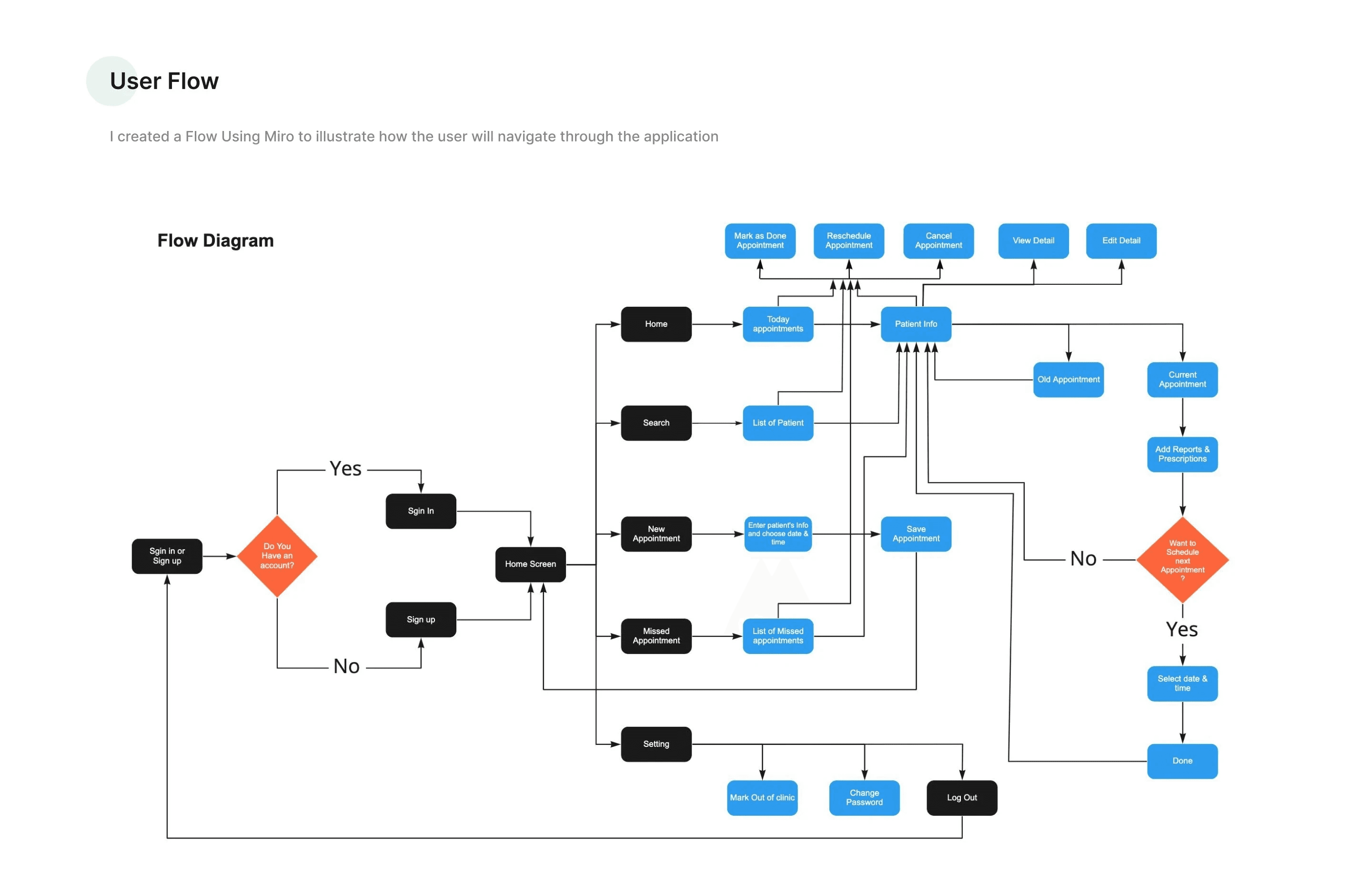
To understand where users experienced friction, I mapped the complete clinic workflow—from appointment booking to consultation and follow-up care.
This exercise highlighted repetitive administrative tasks, unnecessary navigation, and opportunities to simplify the overall experience.
Using research insights as a foundation, I explored multiple navigation patterns, dashboard layouts, and workflow concepts.
The focus was on reducing the number of interactions required to complete common tasks while making critical patient information easier to access during consultations.
Low-Fidelity Wireframes
Validating the Core Experience
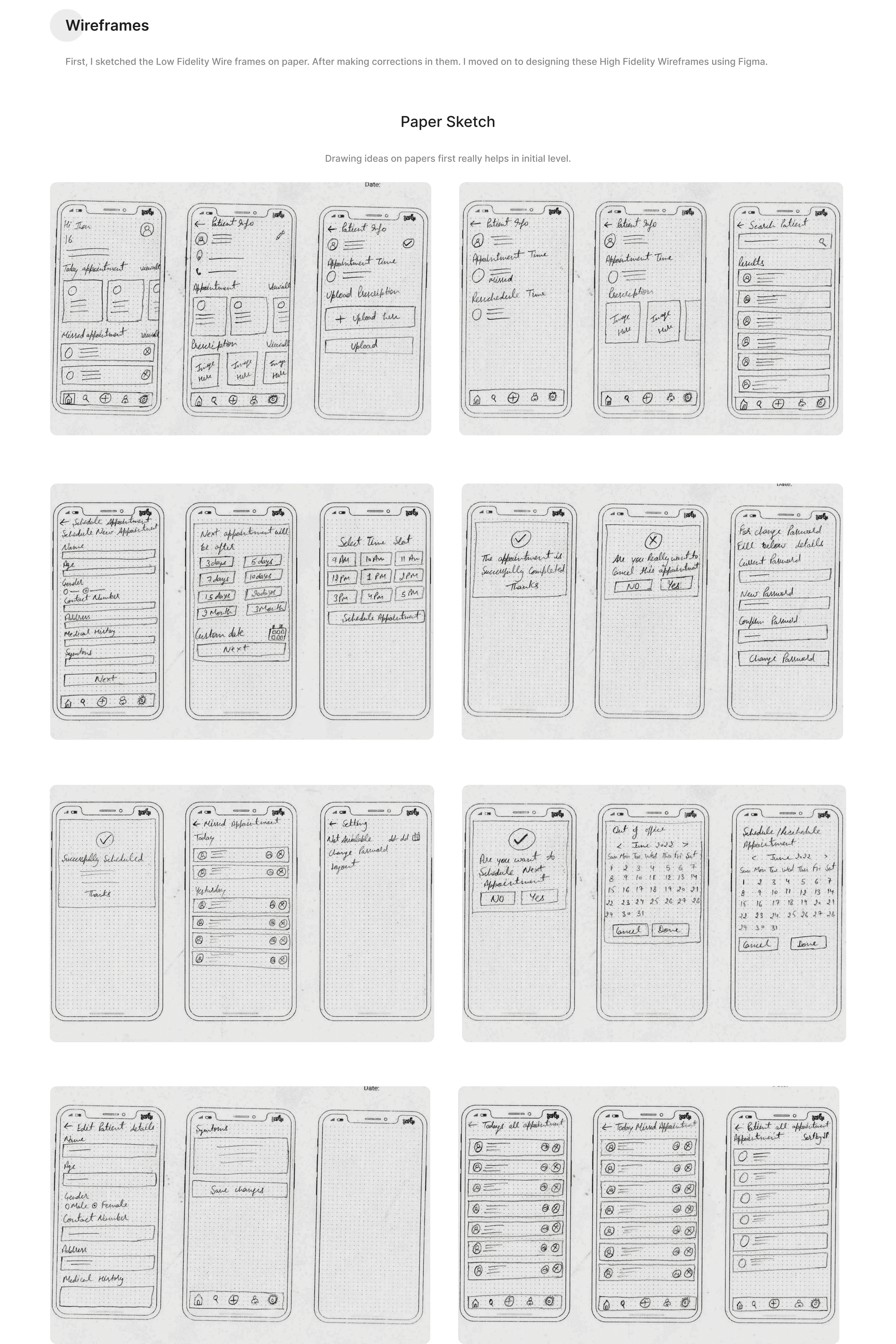
Before investing in visual design, I created low-fidelity wireframes and paper prototypes to validate navigation, information hierarchy, and common clinical workflows.
Early usability sessions helped identify friction points and informed improvements before moving into high-fidelity designs.
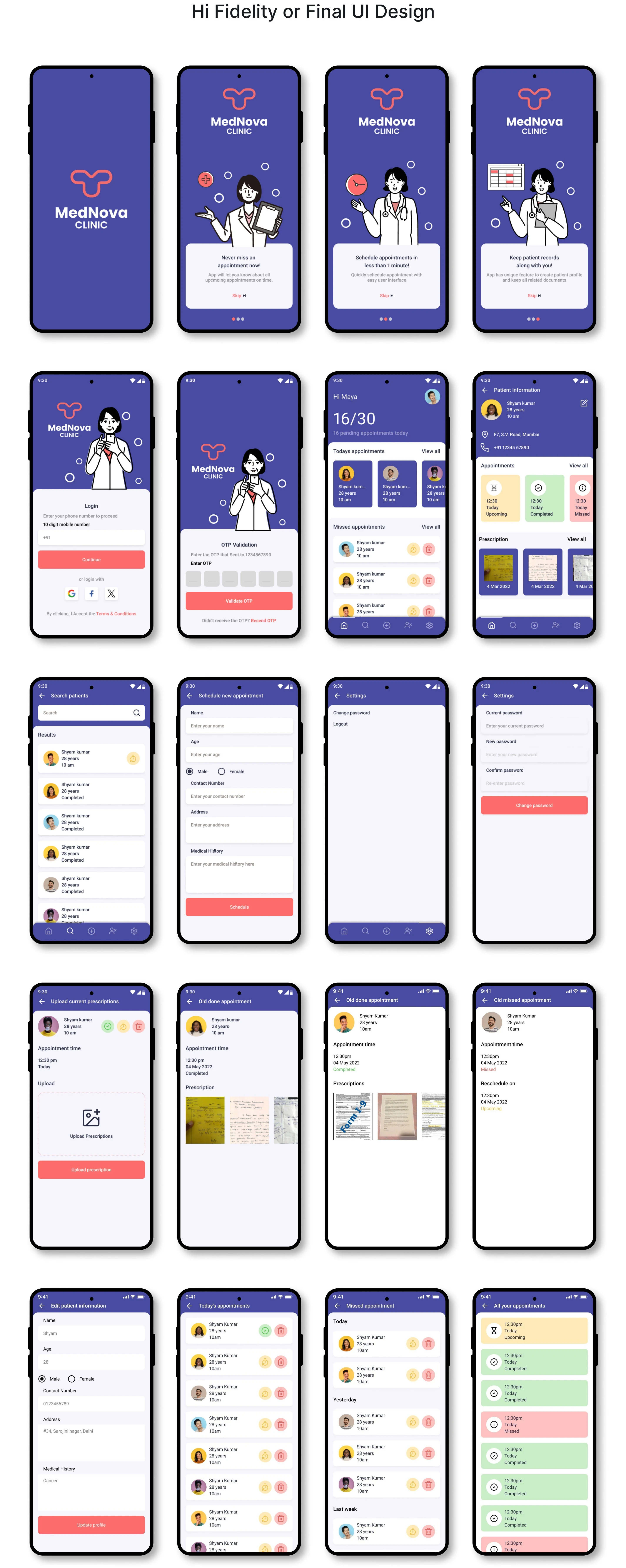
High-Fidelity Design
Designing for Faster Patient Management
The final interface focused on creating a clean, intuitive experience that helped doctors manage appointments, access patient records, review prescriptions, and organize schedules with minimal effort.
Improved hierarchy, simplified navigation, and contextual information made everyday tasks easier to complete while reducing cognitive load.
Solution
A Simpler Way to Manage Patient Care
The redesigned experience brings appointments, patient records, prescriptions, and schedules into one unified mobile application.
By streamlining navigation and prioritizing essential information, healthcare professionals can spend less time managing software and more time delivering quality patient care.
Designs
Building a Consistent Healthcare Experience
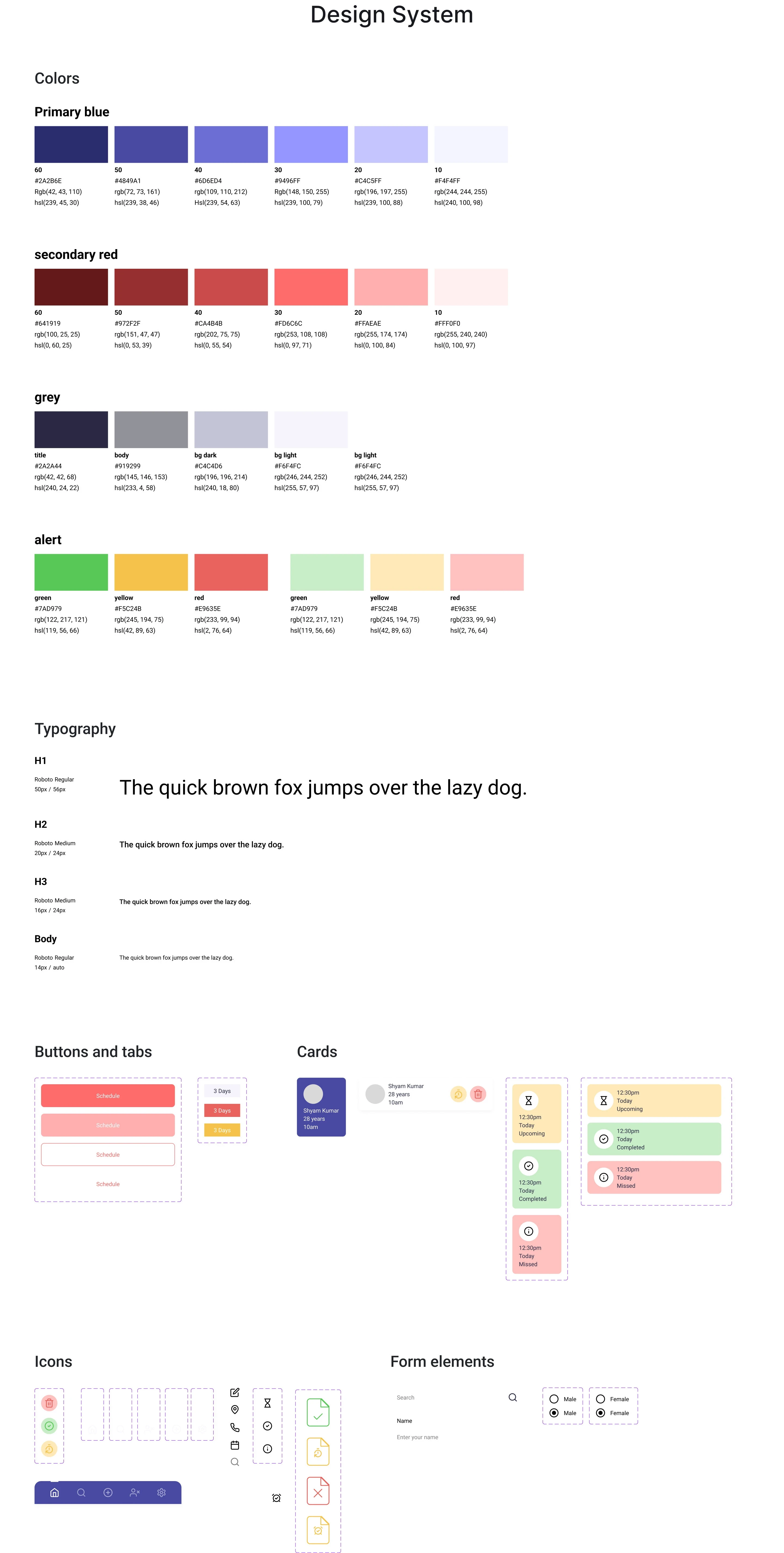
To ensure consistency across the application, I developed a scalable design system that included typography, color styles, spacing, reusable components, and interaction patterns.
The system improved design consistency while supporting future feature expansion.
Impact
Improving Everyday Clinical Workflows
The redesign helped simplify routine clinic operations by making patient information easier to access, appointments easier to manage, and navigation more intuitive.
Expected Outcomes
Faster appointment management
Reduced administrative effort
Easier access to patient records
Improved consultation efficiency
Better overall user experience
Wireframes
Transforming Ideas into User-Centered Workflows
Before moving into visual design, I sketched low-fidelity wireframes to rapidly explore layouts, validate navigation, and map core user journeys. Working on paper allowed me to iterate quickly, test multiple approaches, and refine the experience before investing time in high-fidelity UI.
These wireframes focused on the most frequent tasks doctors perform every day, including appointment scheduling, patient management, prescription history, search, reminders, and profile management.
Outcome
The wireframing process helped establish a clear information hierarchy, simplify navigation, and validate end-to-end workflows, creating a solid foundation for the final interface.
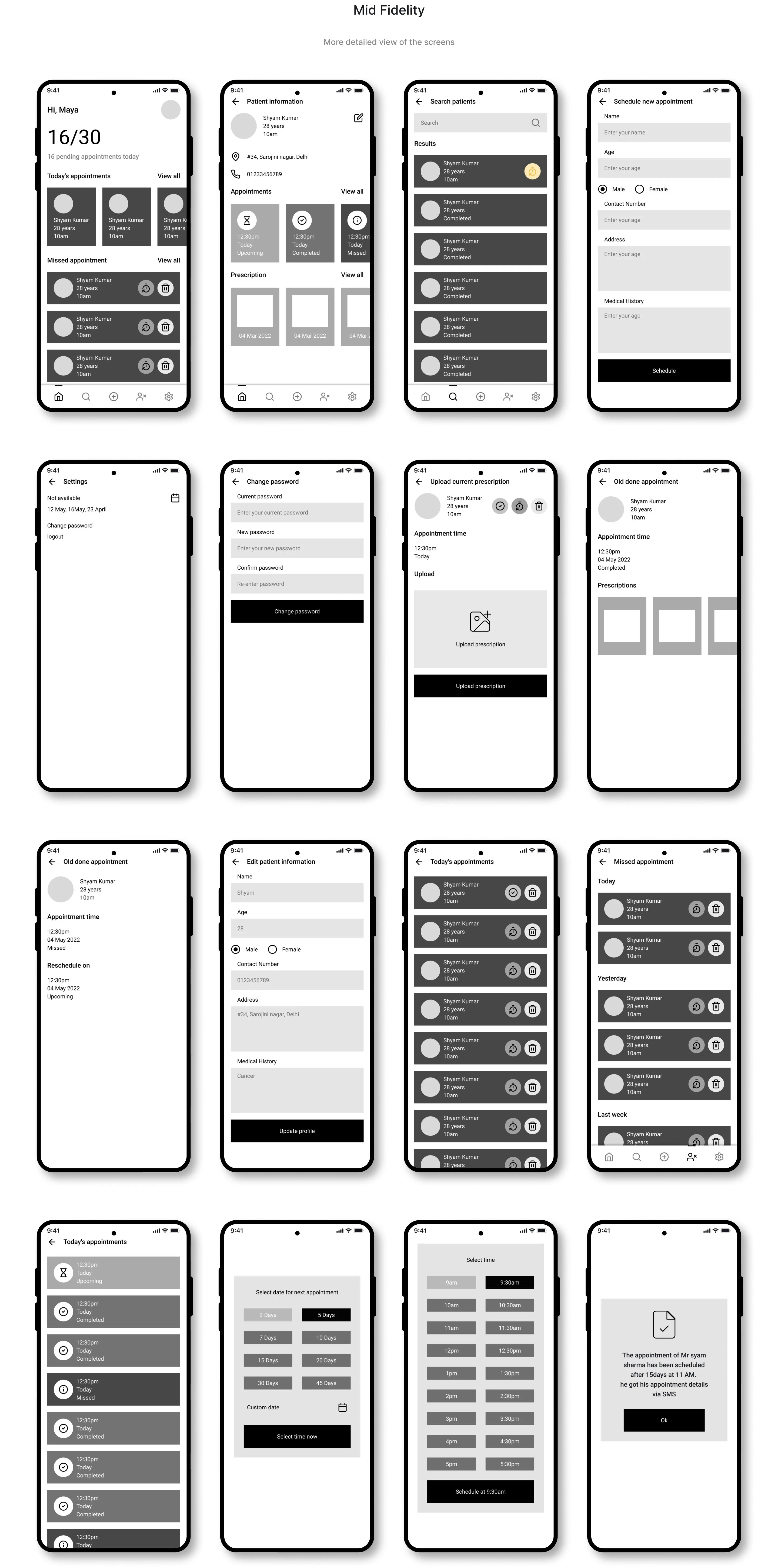
Mid-Fidelity Wireframes
Refining Workflows Before Visual Design
After validating the low-fidelity sketches, I translated the core flows into mid-fidelity wireframes to refine screen layouts, information hierarchy, and user interactions. This stage focused on improving usability while remaining independent of visual styling.
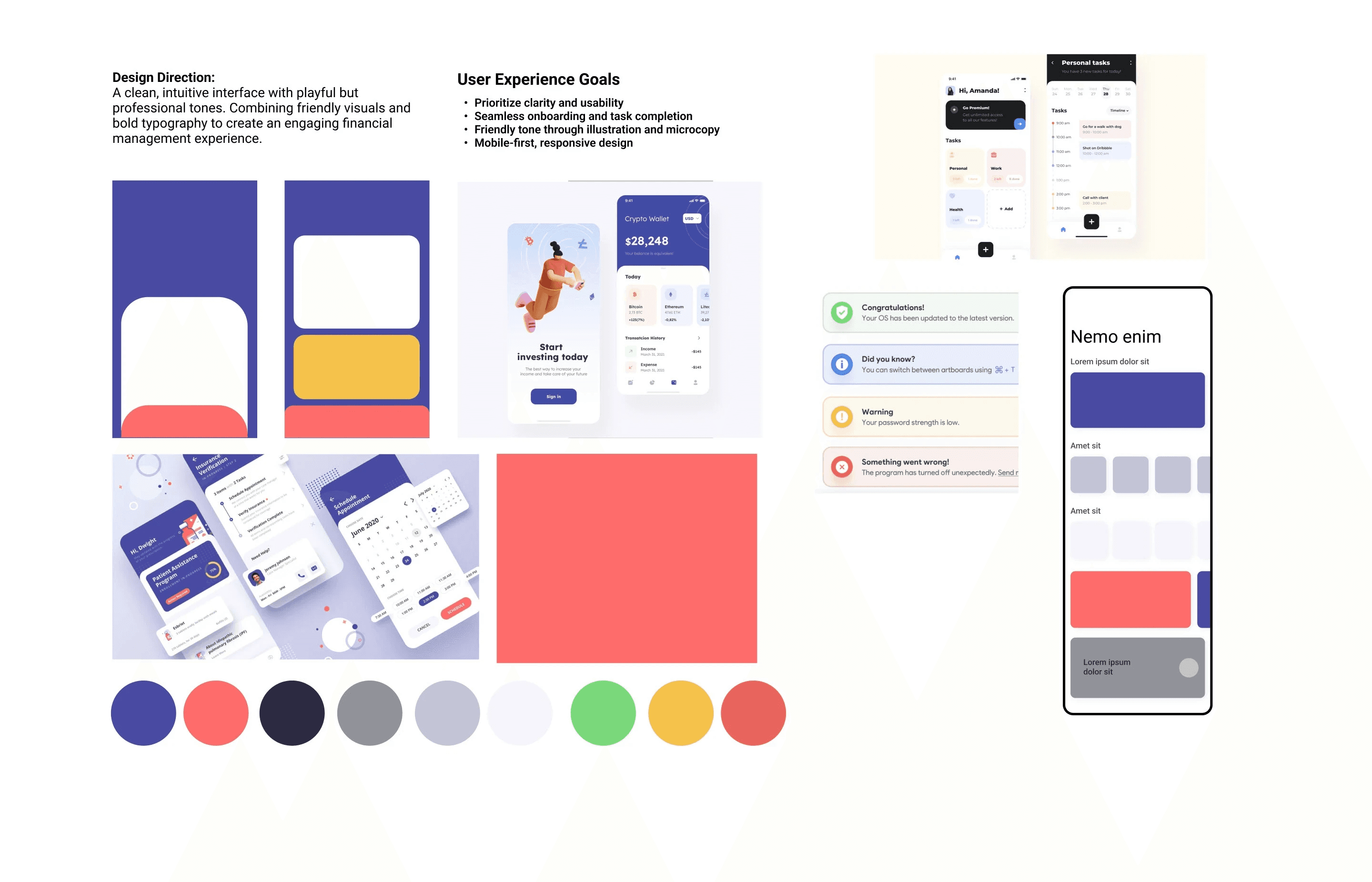
Mood Board
I curated a mood board to define the visual direction of the product, exploring healthcare UI patterns, typography, colors, icons, and layouts. This helped establish a consistent design language focused on clarity, trust, and usability before moving into high-fidelity design.
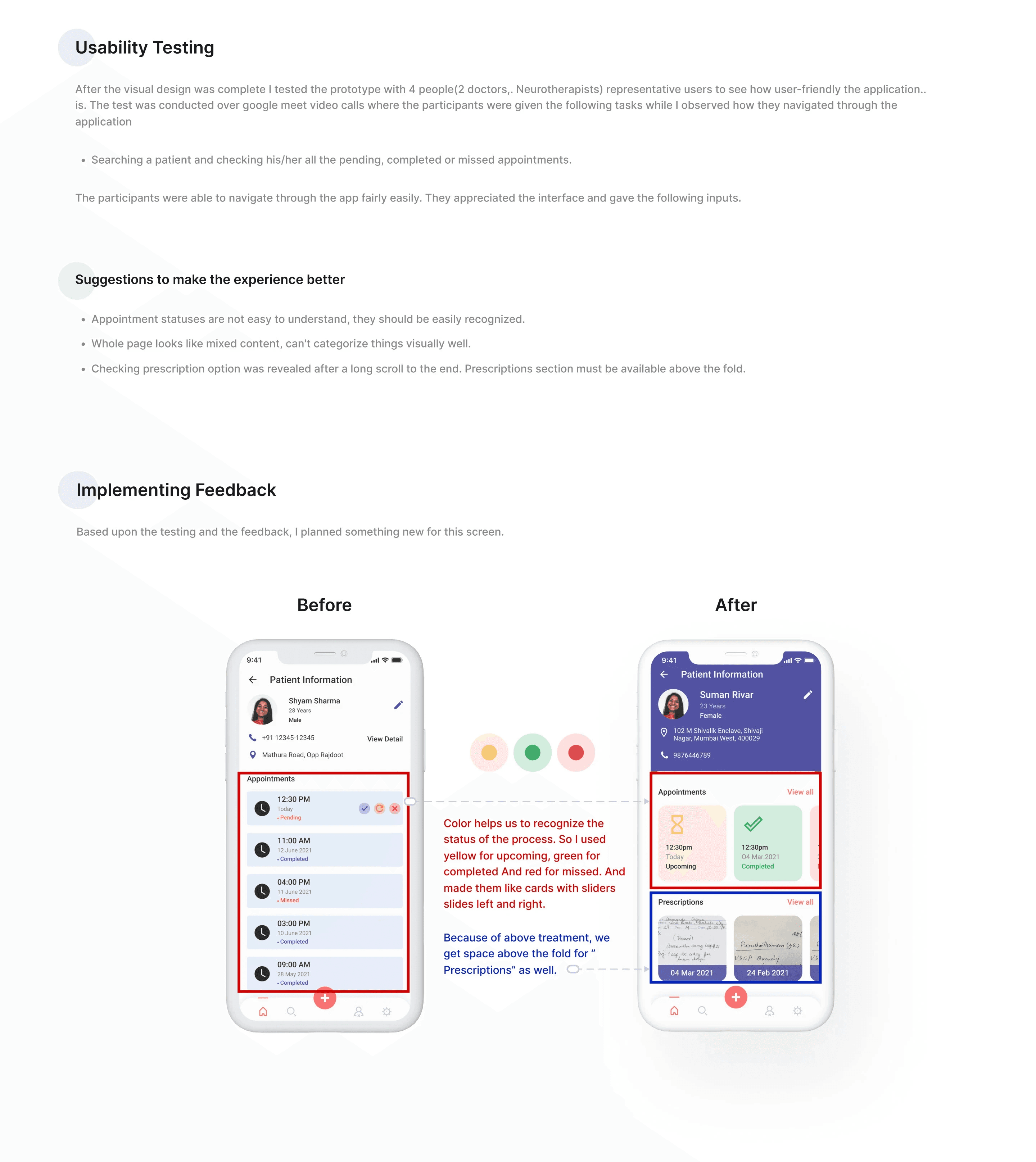
Validated the design through usability testing with doctors to identify usability issues, improve task flows, and refine the final user experience.
Reflection
This project reinforced that great healthcare products are defined by how well they support real clinical workflows—not by the number of features they include.
Working through research, testing, and iteration showed me that small design decisions, such as improving navigation, simplifying information hierarchy, and reducing unnecessary interactions, can have a meaningful impact on both clinician efficiency and patient care.
Lessons
What I Learned
Working on this healthcare UX case study gave me valuable insights into designing for real-world clinical workflows. Instead of adding more features, I learned that understanding users' daily challenges leads to simpler and more effective solutions.
Conducting user research is essential before making design decisions.
Information architecture plays a major role in reducing cognitive load.
Feature prioritization helps focus on high-impact functionality instead of unnecessary features.
Simple, familiar interfaces improve adoption for healthcare professionals.
Continuous usability testing uncovers issues that aren't visible during the design phase.
Designing with empathy creates experiences that save time and improve efficiency.